Coffin Kids #2
Posted: Wednesday, November 7, 2007
By: Steve Saville
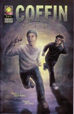 Creator(s): Roslyn T. Amparo and Previn Wong
Publishers: Necroscope LLC
From: USA
Price: US $2.95
If the first part of ‘Coffin Kids’ effectively set up an interesting narrative mystery and somewhat ghoulish atmosphere then this second edition just as effectively develops individual characterization and the relationships between the three main players in this urban tale of dastardly deeds done to the recently [and not yet quite] dead.
This development of the relationship between the older Smoke and the younger Reaper is the high point of this comic. Both have ‘special’ powers that they struggle to come to terms with. Both have had lives blighted with tragedy and as a result both have quite a cynical outlook on life. Both are street wise and exist on the periphery of the city that they live in, preferring to dwell in the shadows rather than face the full glare of city life. Both are united through the death of Smoke’s young brother, ‘Benny,’ and both want to solve the mystery of his death. The fact that Smoke wants to work alone means that the relationship that does develop is a tense one.
Into this mix the creators have introduced a female character, Eva, an Asian angel of mercy type figure.
The relationship between her and the two young men stretches credibility a little as she comes from a privileged background and is from the ‘right side of the tracks,’ so to speak. What does connect the three of them is that she too has special powers.
All of this is very convincing and I was impressed by the way Amparo and Wong manage to spend time developing the characters but still keep the plot moving along at a nice pace.
My major concern though is that this is a three part story arc. By the end of the second part we have a mystery that continues to deepen and seems quite complex, we have the development of some interesting relationships and we have a considerable amount of questions that still need answering. In short we have the basis for a really good storyline firmly established. I do not see how all of that is going to be satisfactorily resolved in the final part. I fear that after some careful exposition the climax and resolution will be rushed and all the good ground work done in the first two parts will be destroyed. I hope that I am proved wrong and I will certainly read the final part with interest to see just how the narrative is resolved.
This edition carries on with the distinctive ‘look’ established in the opening chapter. Heavy use of dark greys and grey tones. Visually Smoke’s dream is probably the highpoint here. I do still have concerns about some variation in body proportions that do tend to mean characters height seems to vary quite noticeably. Oh and the fact that Eva lives in a house that looks very similar to the one Norman Bates inhabited in ‘Psycho’ was a bit of a worry too, not helped by the fact that the word 'psycho’ is used frequently throughout the comic.
I do admire the way the writers have used Reaper’s ability to slip in and out of street slang as a way of developing him as a real person and not just another wise ass punk. In the same way I also admire their ability to weave social issues [Racism, poverty] through the narrative.
Three young people struggling with their powers and getting involved in a macabre series of events that they have little understanding of. Now that’s not a bad premise to base a comic on.
In a Word: Pulsating.
If you have a comment or question about Small Press then feel free to contact me
Only Skin #2
Posted: Wednesday, November 7, 2007
By: Steve Saville
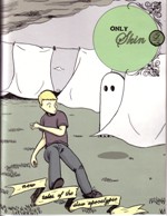 Creator(s): Sean Ford
Publishers: Self Published.
From: USA
Price: US $5.00 Available from secretacres or iknowjoekimpel
Back at Sam’s Service Station darkness has descended and with it another strange disappearance, another set of fingers left behind and more questions are posed than answers found.
This second edition is dominated by the inky, black darkness of night; symbolic of the lack of knowledge the characters have of the strange goings on that surround them.
The overriding tone on this second instalment is one of darkness, an oppressive blanket of darkness hiding the truth and creeping over this small blighted town.
One of the characters describes it as “a gathering storm’ and it certainly does have the feeling of something brewing up and about to burst.
It is hardly surprising then that the locals are starting to get just a little tense and restless. The community meeting provides more questions than answers and Ford just keeps turning the tension dial up.
Into this world of weirdness Cassie and Paul make their initial fumbling attempts at forming a relationship but it all comes to nothing, it is as if there is too much to think about here to allow for normal relationships to flourish.
As in the initial edition, the words are carefully chosen but it is the spaces between them that drip with meaning. The art is once again aimed at creating a feeling of expansiveness, it feels like this little community is in the middle of a big empty world, they are alone and powerless.
There is little to get hopeful about here apart from the fact that as this chapter ends young Clay meets a local boy who has also seen the strange, 'cartoonish' ghost that has been stalking Clay since his arrival. Overall Paul, Cassie and the others are no nearer finding any answers and to make it all worse the Albert, Paul’s friend and associate, has wondered off to see if he can solve the mystery•by himself•in the dark.
Thoroughly enjoyable, delightfully tense and I can hardly wait for #3.
In a Word: Dark.
If you have a comment or question about Small Press then feel free to contact me
Only Skin #1
Posted: Thursday, October 25, 2007
By: Steve Saville
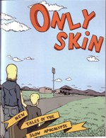 Creator(s): Sean Ford
Publishers: Self Published
From: USA
Price: S $5.00, available from secretacres or
There are so many reasons why I love this comic. I mean the subtitle alone, ‘New Tales of the Slow Apocalypse’ is reason enough, and then there’s the fact that it features a Captain Haddock [Tintin] look alike character, well that’s me won over.
“Only Skin” is set in the wide expanse of middle America, and it is that broad and empty vista that dominates this first edition. The normality of this small town/ isolated setting is being threatened by the strange disappearances of some of the town folk. The mystery has a macabre flavour added to it as those who have disappeared have left a small part of themselves behind, namely their fingers.
No one seems to know exactly what is going on or if they do they are not saying anything, and it is that sense of what is not being said that really unnerves.
Ford’s skill is in his ability to create and maintain this atmosphere of tension and foreboding. The narrative is sparse and often simplistic but it is what is not being said, it is the action between the frames, it is what is going unsaid in the minds of the characters that dominates. We are constantly aware that the real action is taking place somewhere else, just off the page, just around the corner, and it starts to get more than a little scary.
There is a mystery to be solved then.
We arrive at Sam’s Service Station with Cassie and Clay, the two children of the owner who has joined the ranks of the missing. They have come ‘home’ to take over the running of the business and to find their father. I must say that their optimism is not shared by many of the locals.
One of the many admirable features of this comic is despite the main narrative thrust of the macabre and sinister disappearances Ford has not shirked on the careful character development front. The main characters are slowly and deliberately revealed as real, if troubled and confused, people. The laconic narrative pace matches the setting perfectly and also allows Ford the time to carefully reveal character and plot in a measured and considered manner.
The art work is charmingly simple, very reminiscent of Dylan Horrocks [“Hicksville” and “Atlas”] and just like Horrocks, Ford is able to create a wonderful sense of space, a feeling of a huge world spiralling around a smaller focussed one. Attention to detail like cloud shape is a feature of Horrocks and that same awareness is evident here. It is the feeling of emptiness that dominates this comic, a physical and a spiritual emptiness, a void that Ford slowly fills with a sense of threat and unease.
It is a town that could well be near Roswell, it could be a town that is linked in many ways to Twin Peaks. It could have the characters of Baghdad Café lurking in the shadows; it could become an X- Files case. It could be so many things but I have a feeling it will turn out to be something dangerous and new and very exciting.
Make no mistake this is a good one, and the best thing of all is that Sean sent me #2 with this first edition so whilst I would love to write some more I am far more interested in getting back to Cassie, Clay and that strange ghost that is floating around.
In a Word: Finger-licking-good
Sean sent me copies, and Horrocks sprang to my mind as well. Please note, that's the last time you get to use hyphens to make one word Steve! Ed.
If you have a comment or question about Small Press then feel free to contact me
El Valiente #1
Posted: Wednesday, October 24, 2007
By: Steve Saville
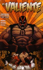 Writer(s): Ray Ramos
Artist(s): Elmer Pasaoa
Publishers: Adversary Comix.
From: USA
Price: US $2.99
Action packed with a capital A.
‘El Valiente’ is a mix of corny Pulp action and Mexploitation as the muscle bound main character, a masked Mexican luchador takes on Ninja robots, mad professors, Count Dracula and anyone else thrown at him.
And as he wades through a solid mass of baddies we ask ourselves why he is bothering. The answer my friend is visually obvious, to save the scantily clad twins with enormous breasts who are never far from his side. These two give a whole new meaning to the term ‘well endowed.’ When they are not screaming with fear they are busy popping out of their too, too small bikinis.
What we have then is a real salsa mix of Jack Black’s movie character, action bursting from every page, conventional comic and characters and big boobs. What more could you want?
As you would have realised by now this is not an intellectual comic, it is an action one and so extended fight sequences tend to dominate the 23 pages. It is all good fun though. The bold colourful cover attracts attention and the opening page certainly establishes the tone. There is El Valiente shackled next to the twins [equally shackled] while the evil Professor Terror prepares to zap them with a deadly and ‘over large’ ray gun.
We are presented here with two stand alone tales separated by a very amusing pseudo advertisement. Personally I enjoyed the initial story more. The art work was bolder and felt less cluttered and anyway El Valiente is wearing a stupid sweater in the second tale.
The skilful marrying of clichéd Mexican phraseology with English in the narrative works brilliantly, it creates a real south of the border atmosphere that adds to the overall authentic feel of the comic.
The main problem that I have is that as the main character is masked throughout it is hard to identify with him. After all Batman is also the unmasked Bruce Wayne and this helps us, as readers, to get to know him. In the same way the heavy reliance on action tends to overshadow characterisation in this initial edition. None of which is a problem if this is a ‘one off’ but if this is the first part of an ongoing series [and I certainly hope that it is] then some care will need to be taken over adding a personality to the brawn.
There is a real witty tongue in cheek feeling about this comic, it feels like it was fun to create and it certainly is fun [though not by any means deep] to read.
In a Word: Arriba.
If you have a comment or question about Small Press then feel free to contact me
Death, Cold as Steel #2 and 3
Posted: Wednesday, October 10, 2007
By: Darren Schroeder
 Writer(s): Bram Meehan
Artist(s): Jamie Chase
Publishers:
From: USA
Price: US $2.99 each.
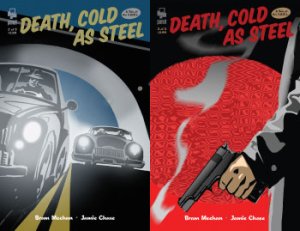
Norris is investigating the death of the indestructible man. There aren’t many leads, but even so the G-Men are worried that he might stumble onto the truth and have warned him off. It’s a shame for them and a pleasure for the reader that Norris isn’t one to take uninvited advice.
This book is hardboiled through and through. Norris takes the bruises but keeps looking, all the dames look slightly devious, and two-bit thugs lurk in every dark alleyway.
The core plot here owes much to Alan Moore’s Watchman series so those of you looking for truly original storytelling will be disappointed. But the style in which this series tells its tale makes it a satisfying read. Jamie’s art work is a real pleasure to look at. It drives the story along with a series of striking images that invite careful examination. The simple line work achieves a photographic quality, enhanced by some distortion that occurs where individual panels seem to have been resized to fit the page layout. I know that sounds like it might look rubbish, but here it gave the images an emphasis that I enjoyed.
Monica Meehan is credited here with letters and production, and she deserves attention for her work because these comics look great. This and her art work in the sister title Raised by Squirrels are some of the best produced comic books I’ve seen for a while. Panel Press have a real creative asset here.
While this series isn’t an epic blockbuster of a comic, it’s memorable both in narrative and visuals. It’s certainly worth tracking down.
In a Word: Impact.
If you have a comment or question about Small Press then feel free to contact me
